Pate State Freights
Branding
Digital
Illustration

About
"Josh Pate's College Football Show" is now the #1 college football podcast on iTunes and Spotify. Josh has created a year-round podcast entirely focused on college football. We partnered with Josh to refresh the visuals for his show's sub brand, "Pate State Freights." We wanted to create consistency across the different marks in use for the brand, as well as position it to feel more like a college team's suite of logo marks.
After refreshing the visual identity for the Freights, Josh moved forward with changing the name of the show from "Late Kick with Josh Pate" to "Josh Pate's College Football Show." We worked together to build a typographic mark that was used as the studio backdrop sign that was visually in line with the identity we had built for the Freights. Details shown at the end of the case study.
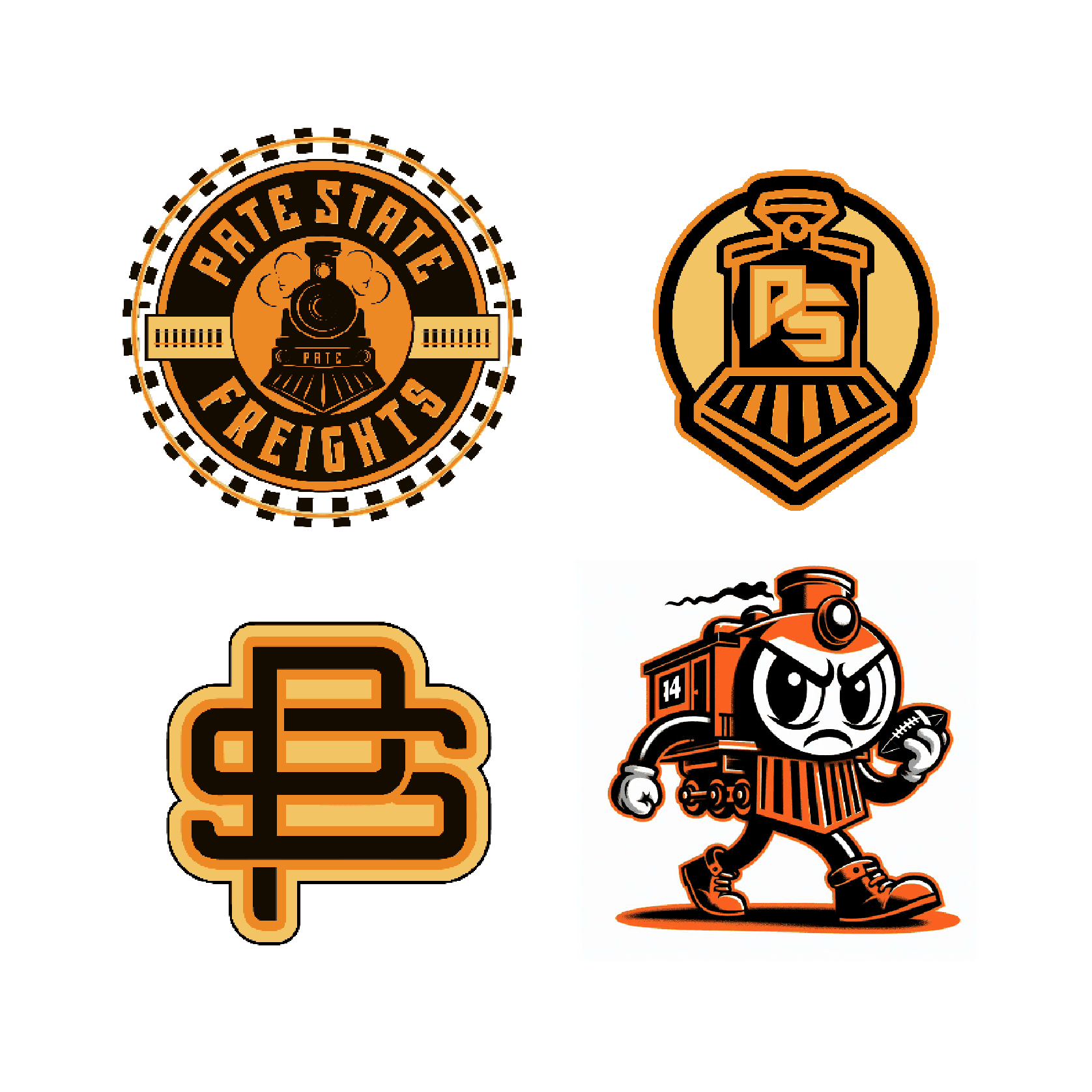
These were the original marks in use for the Pate State Freights. They lacked cohesion, and the colors didn't support the brand story. We opted for a more traditional sports logo vibe, incorporating a red, white, and blue color scheme to represent Josh's "America's Team" brand for Pate State. Some sketches and in progress marks are shown below.


After exploring through sketches, we decided to move forward with a modernized version of the original logo. Josh has a "vintage" inspired badge that has a similar layout as the smoke billowing over the circular badge, so we decided to use that motif in the main / updated logo.


After developing the initial visual brand update for Pate State, Josh reached out to us for help with a sign for the set on the show. Josh Pate's College Football Show had been previously known as "The Late Kick with Josh Pate," and after building the brand for Pate State, Josh had decided to change the name of the show to be more in line with the rest of the brand.
Below are the concepts and execution for the sign we developed. Josh was working closely with the folks at CBS to design the set, our role was a little bit of art direction & lettering to keep it all in line with the visuals we had developed for The Pate State brand.
After exploring a few options, we settled on the script version of the sign that was in line with the "Pate State Freights" logotype above.


