Yelp event creative & brand refresh
Lettering
Digital
Illustration

Client Name
Yelp
Credits
Team mates, collaborators, and friends - Kevin Sandoval & Andres Hernandez
Art directors - Danica Conneely & Nick Jacobs
Scope
Event material design
Yelp brand refresh
Yelp Elite Squad logo design
Misc. materials for the Yelp community
Client Site
About
During my time with Yelp, I worked within the internal agency. Typically, I collaborated with the Yelp community team. The community team consists of over 150 community managers across the U.S. & Canada. The CM's frequently put on events in their cities to give perks to power users on the app, and to bring the foodie and review community together in each of their cities. We built hundreds of custom event materials for the community managers, ranging from simple event promotion material to large scale print & digital media.
In addition to my work with the community team, I contributed to brand level work across departments. Notably, I participated in a brand refresh campaign for Yelp where I worked on design, illustration, and overall visual brand refresh for Yelp in 2017/18. More about this project below.
These are a few select projects that I worked on during my time with Yelp.
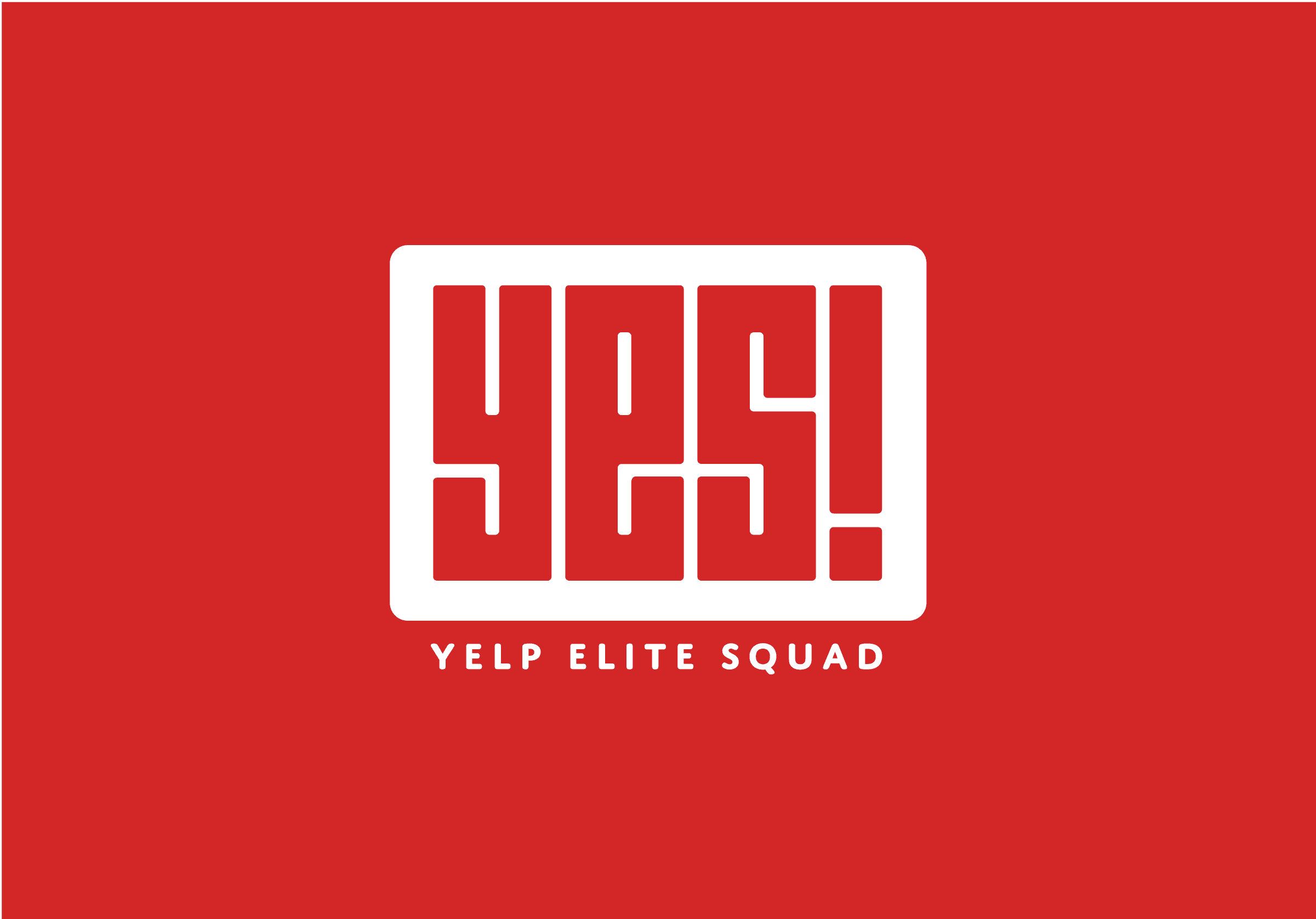
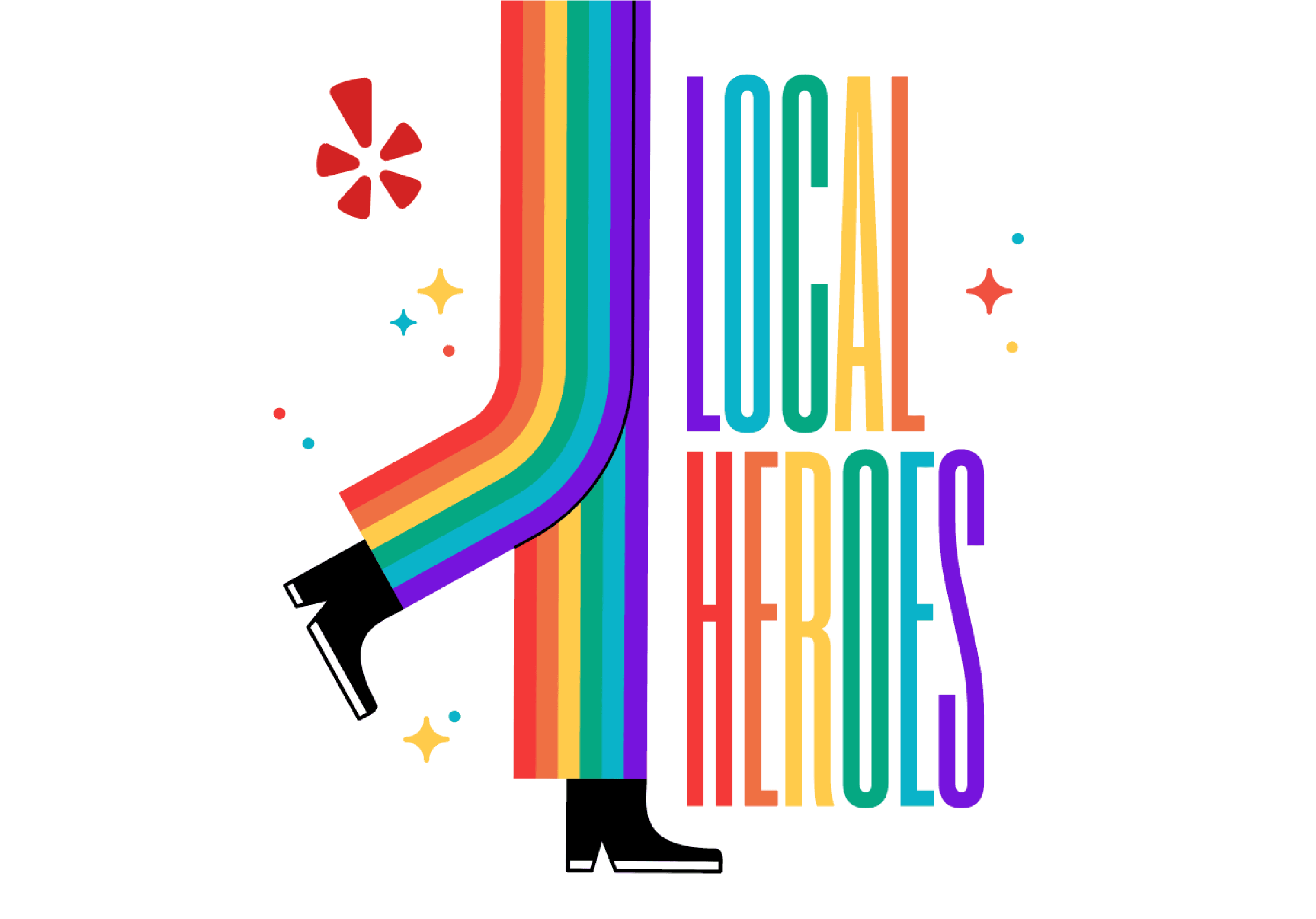
Building a logo for the Yelp Elite Squad
One of my first projects at Yelp was developing a logo for the Yelp Elite Squad (aka YES!). This refresh came at a time that the internal agency was building more broad marketing campaigns for the community team—and building a new logo was a core piece of the overall visual identity. This logo has taken on a life of it's own through all of the individual Yelp communities, and it's a pleasure to watch it still hold up almost 10 years later.

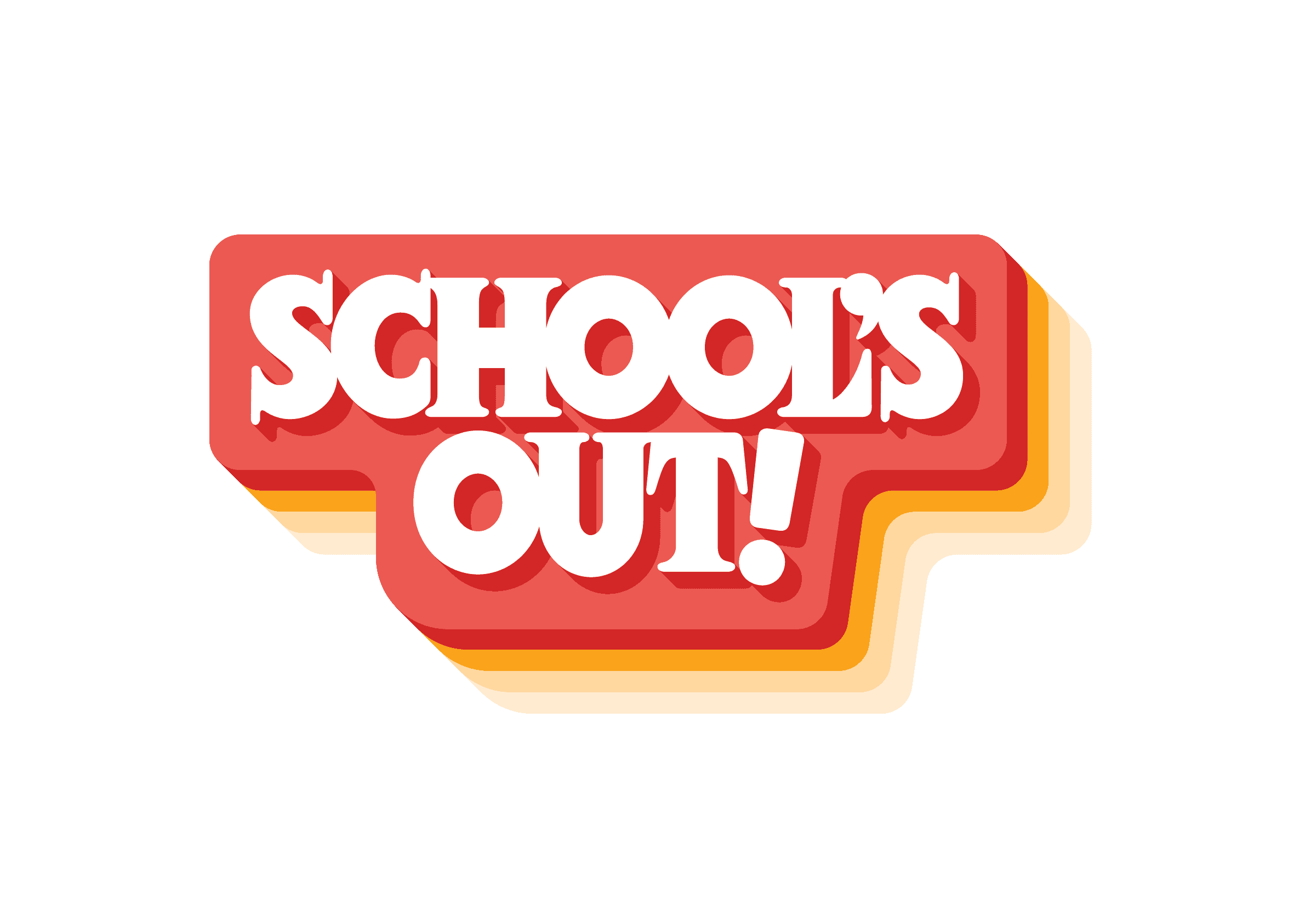
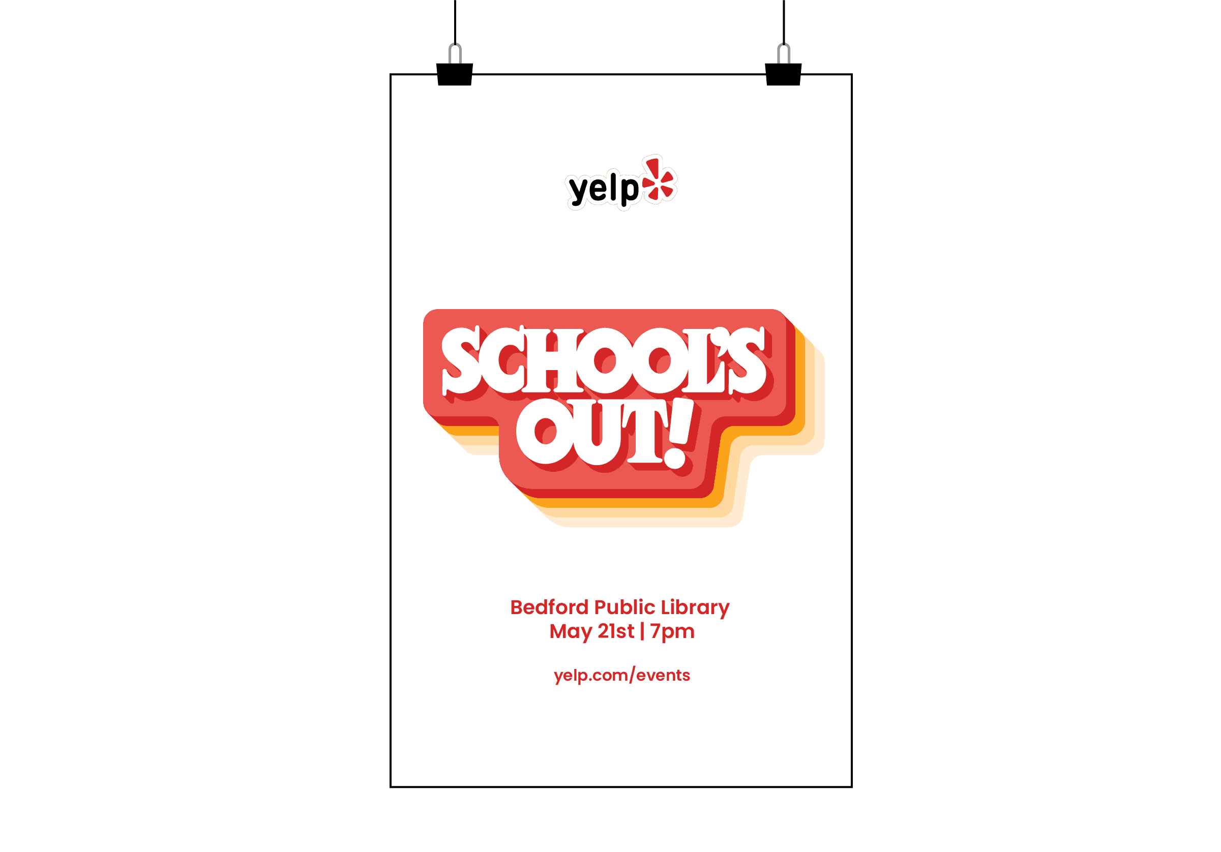
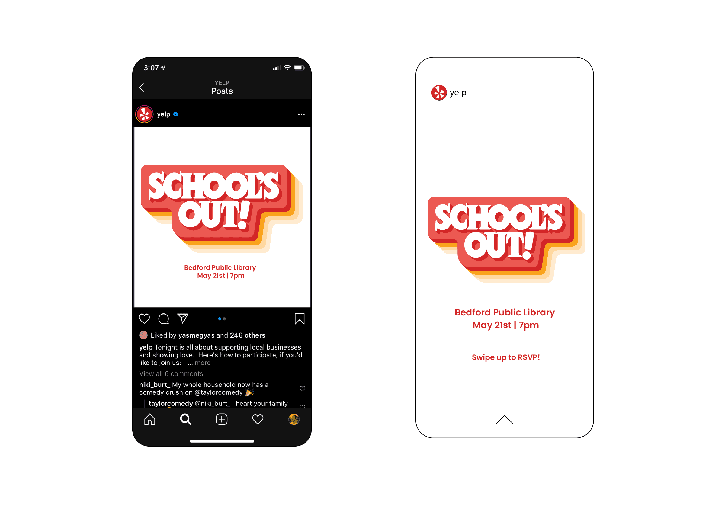
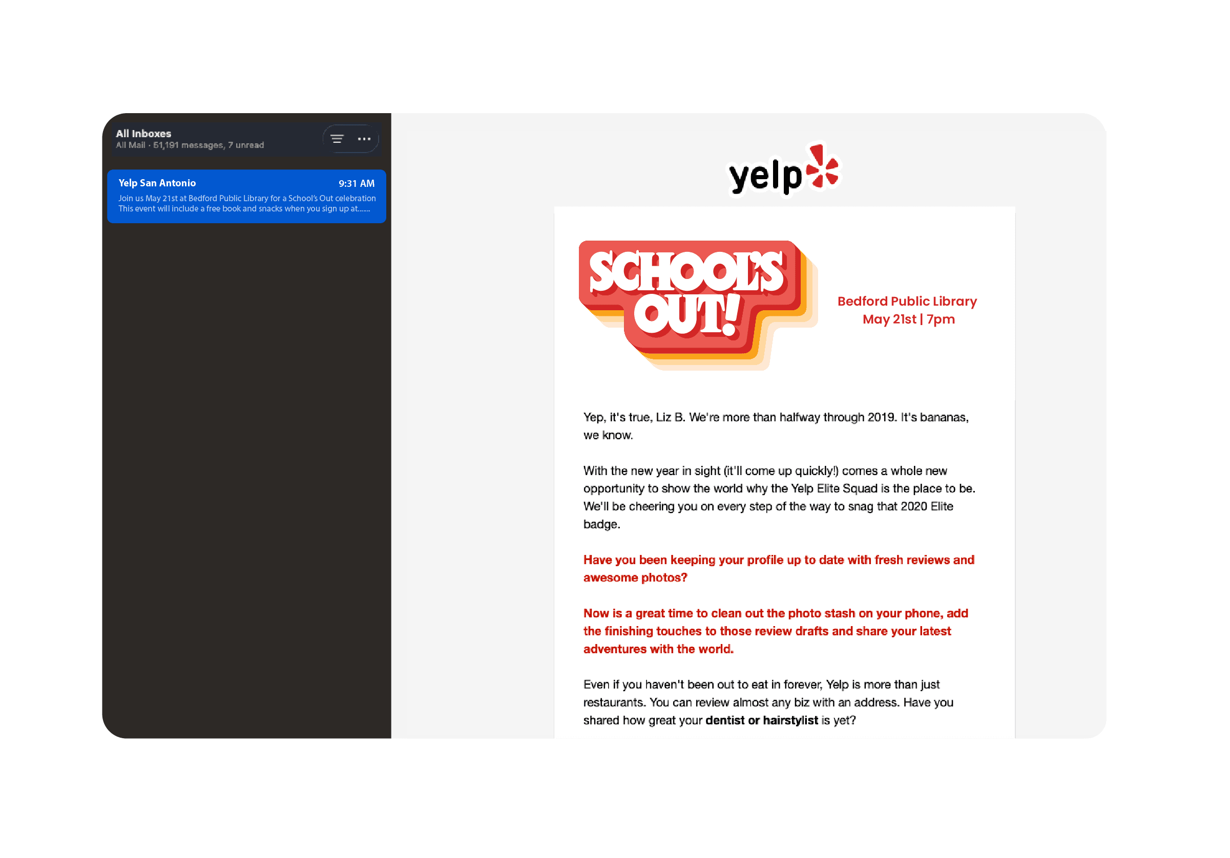
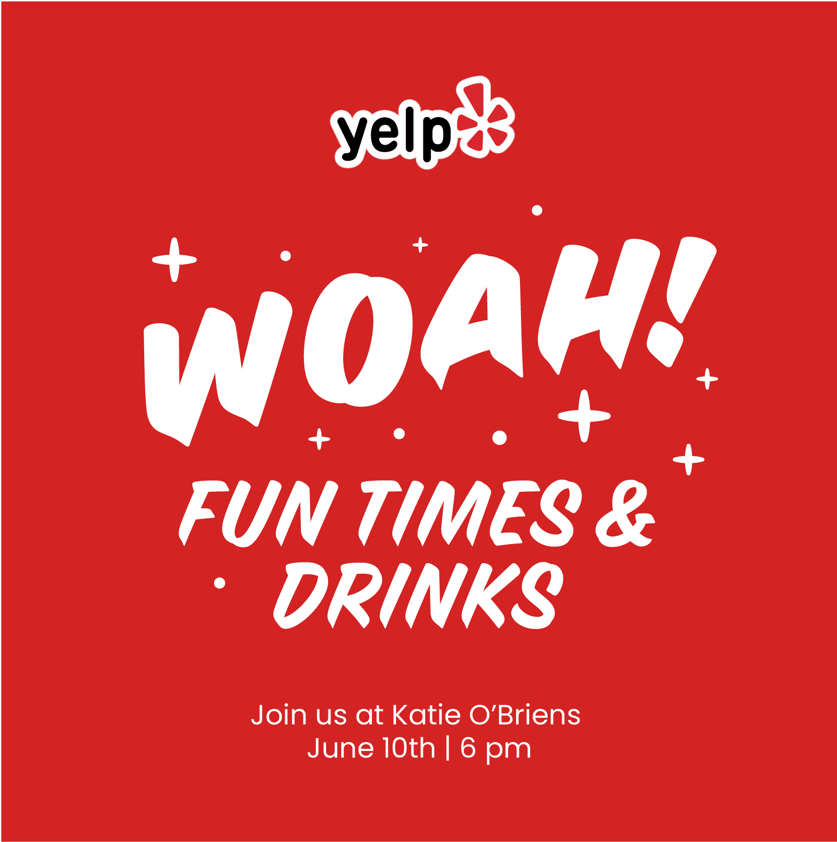
A typical community event - School's Out!
Community manager's would build fun concepts for the parties they'd put on in their cities, below is an event that was put on at a public library at the end of the school year—just adult themed! Cocktails and great food provided by local vendors where Yelp Elite members in San Antonio would come to enjoy.
Contributing to a brand refresh - the problem
When I first joined Yelp, our visual brand from product to marketing to community wasn't cohesive. The community team had their own visual style, the product team had theirs, etc. etc. During my time there, the creative leaders came together to refresh Yelp's brand.
This was a unique challenge—especially for those of us working with the community managers. The CM's had grown accustom to having complete creative freedom with their events. Most were not warm to the idea of a more unified visual style for all events happening across Yelp communities. They felt the creative needed to feel custom tailored to those communities and events—and we most definitely understood the desire for that. Though, again, Yelp had a brand problem overall. Nothing was cohesive visually, and messaging wasn't consistent across product, marketing, or community touch points. This led to fractured marketing campaigns because we weren't speaking the same language to all users across all touch points.
My role in the refresh was to contribute a unified typographic solution for marketing, as well as help my teammates Kevin and Andres with illustrations & brand visuals.
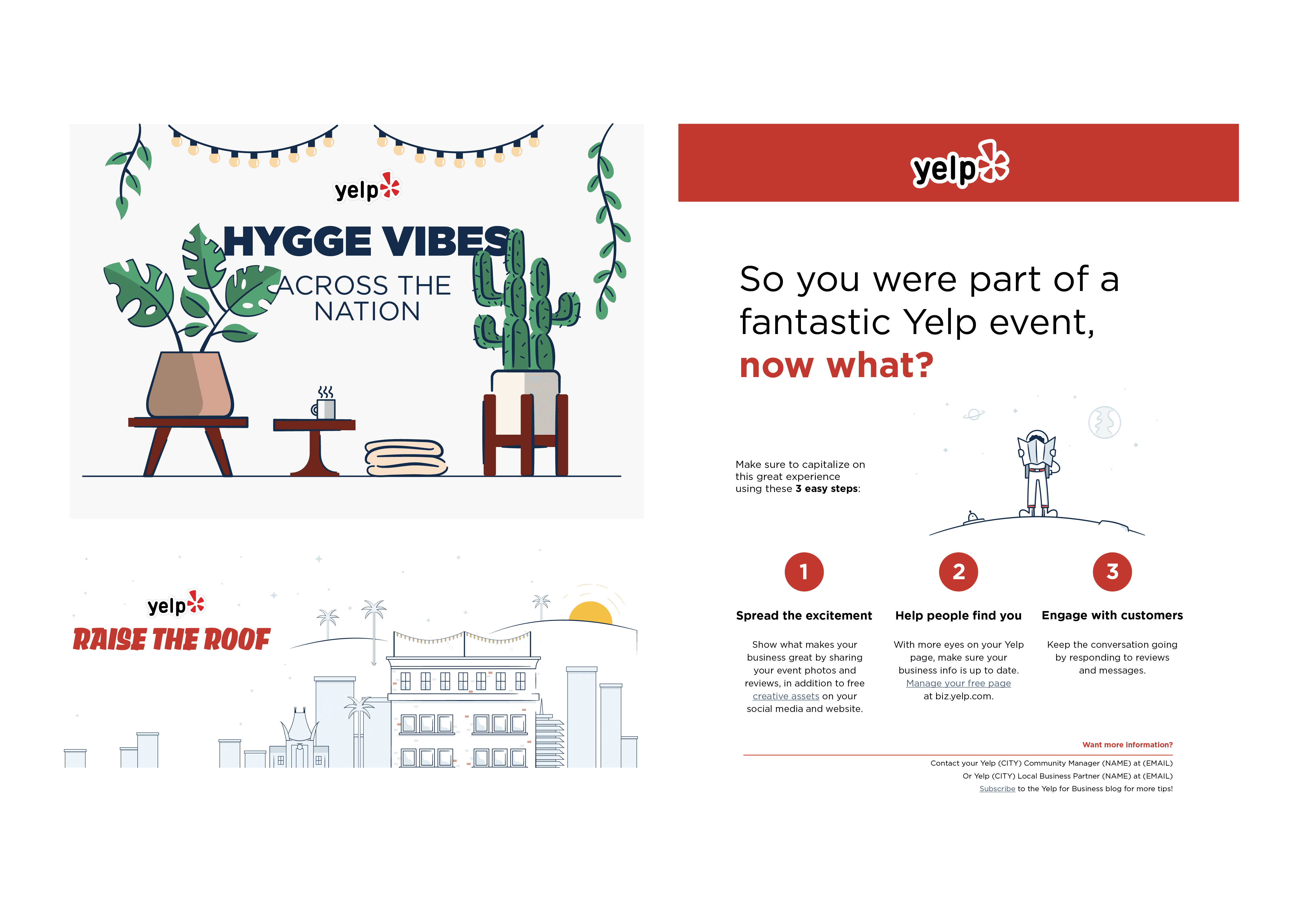
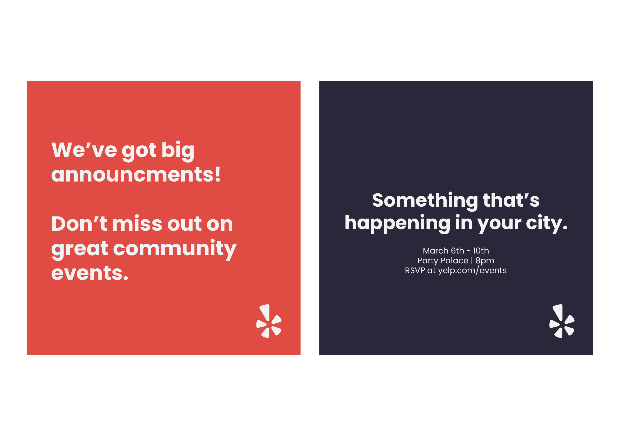
Below is the "status quo" illustration & design visual style:
Contributing to a brand refresh - the solution
As you can see in the "status quo" illustration style, it was bloated and complicated. It was difficult and time consuming to build truly good visuals that felt on brand and could scale to the requirements. Our goals for the refresh were to:
Build a design & illustration system that felt on brand with the Yelp products
Allow the community event assets to be flexible and custom, but still unify the style
Increase our efficiency for production of marketing assets, illustrations, and visuals
This meant joining in on various meetings that took place across a months long initiative to unify the brand. The initiative was created and lead by the head of product, and all departments were encouraged to participate. Myself and various teammates within the marketing department joined alongside many of the product designers and illustrators to build illustration and design guidelines that could flex across all touch points.
I contributed heavily to recommending a standardized group of typefaces that were approved for use in marketing & community materials, as well as building illustrations and assets that would be used in marketing & product assets. Myself—along with my co-workers Kevin and Andres—built a style guide for marketing and community assets. These are a few samples of the work we created:
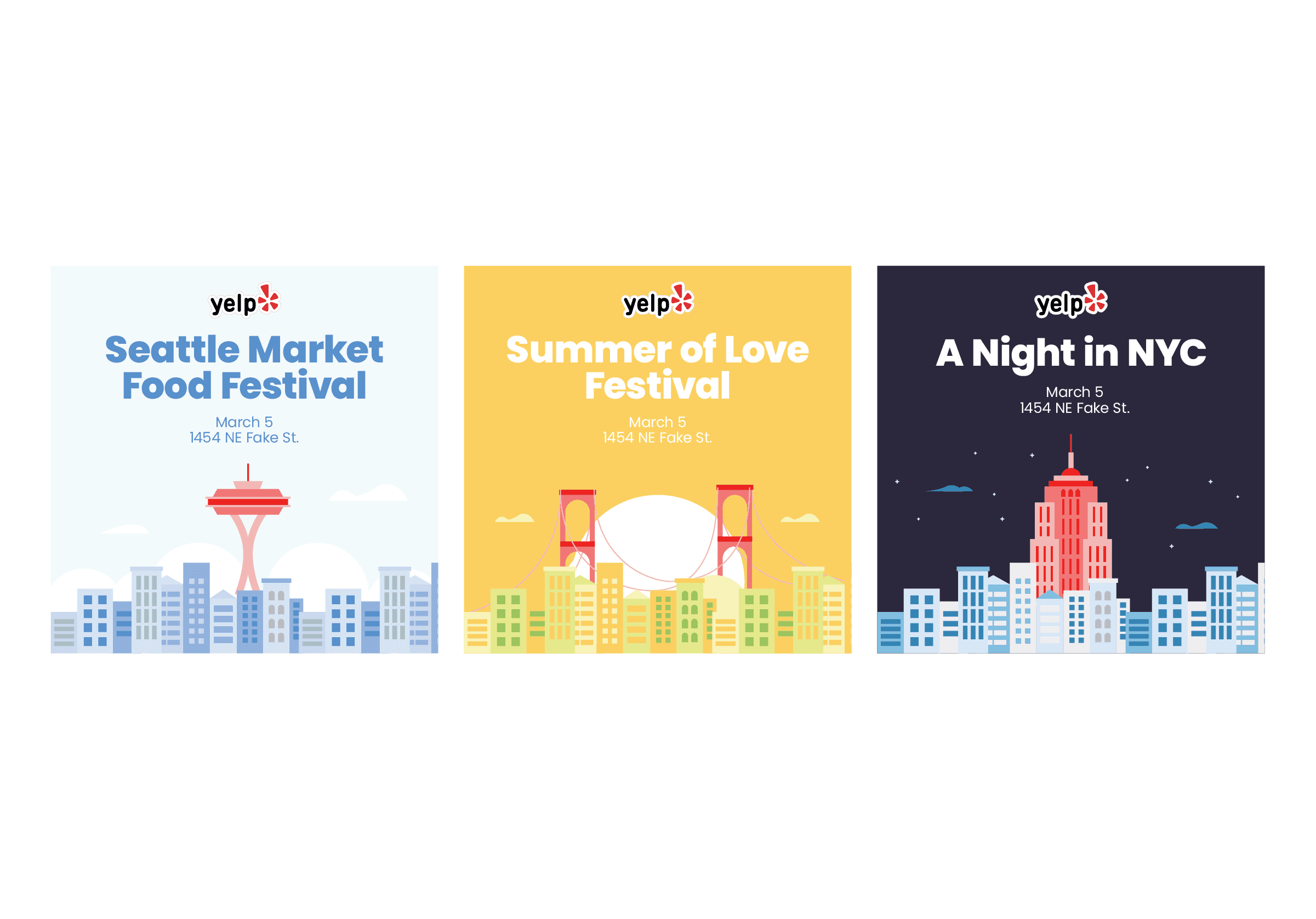
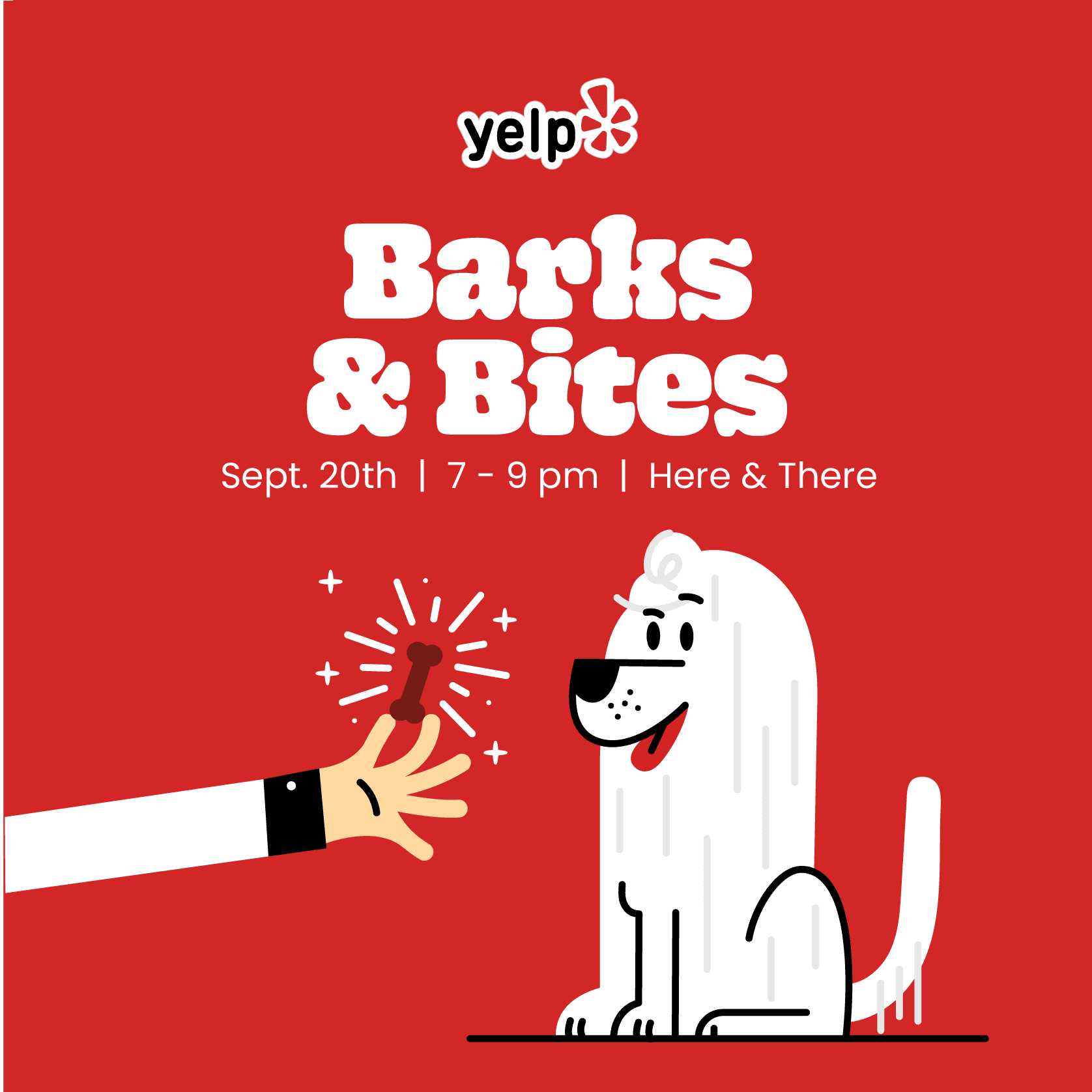
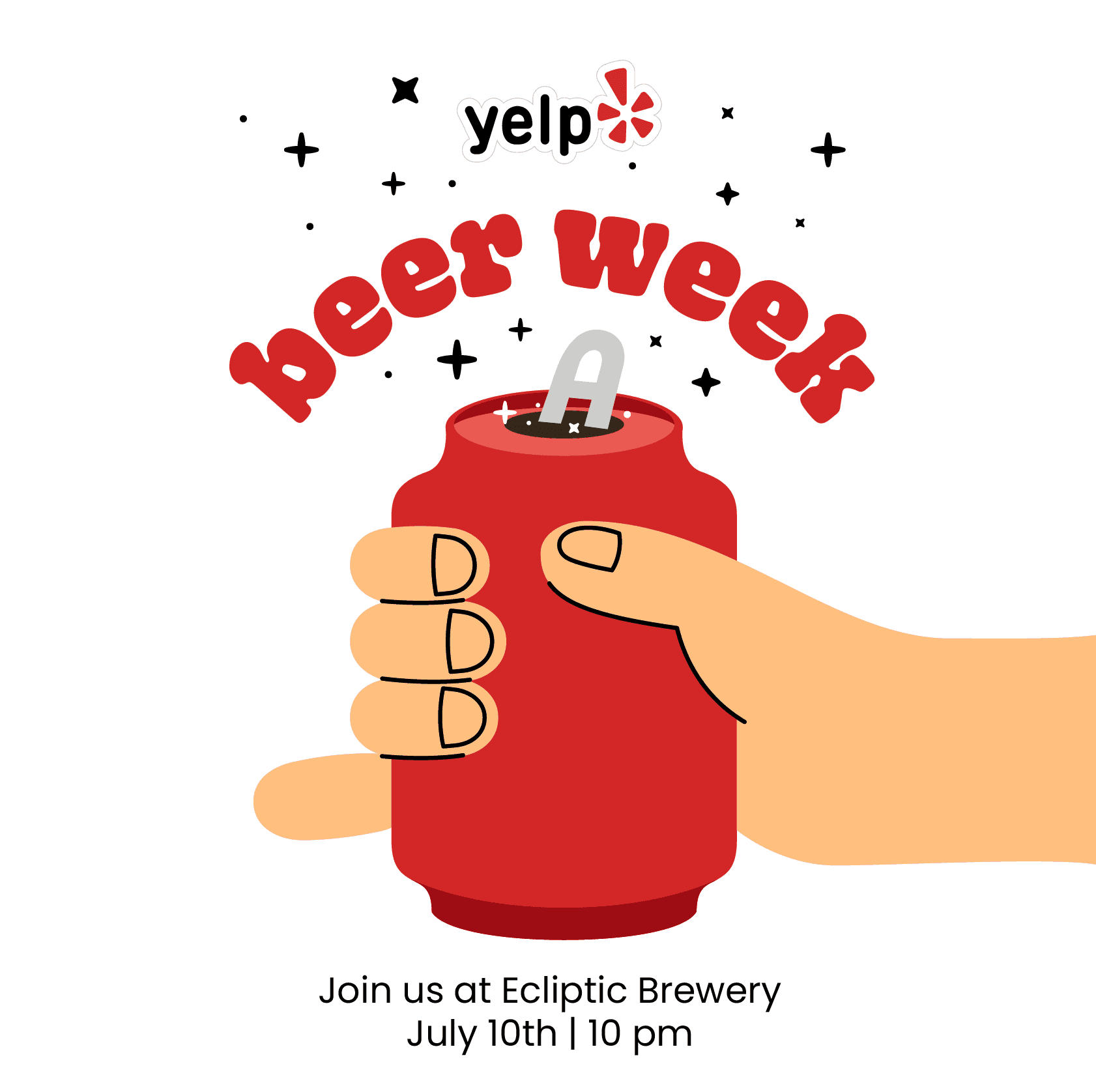
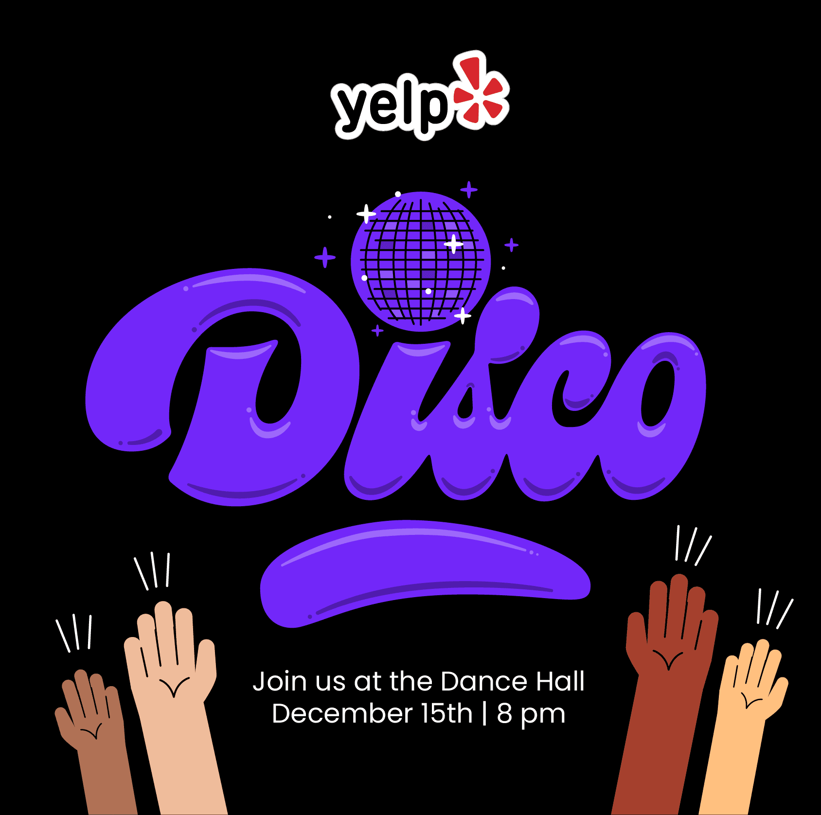
Overall we significantly reduced the complexity in the illustrations, simplified design layouts, and built a more cohesive visual system for marketing materials. It allowed for more standardized layouts & templates that we created in Canva. This allowed many of the community managers to build some of their own assets, reducing our day to day production work load and allowing us to focus on higher level brand and marketing design work.
I'm proud of what we built and proud of the level of collaboration this took on all fronts. Though I only directly contributed a small piece of the overall brand, I was able to build stronger relationships across the company and provide input on all aspects of the refresh.